April 2026 // Client Work
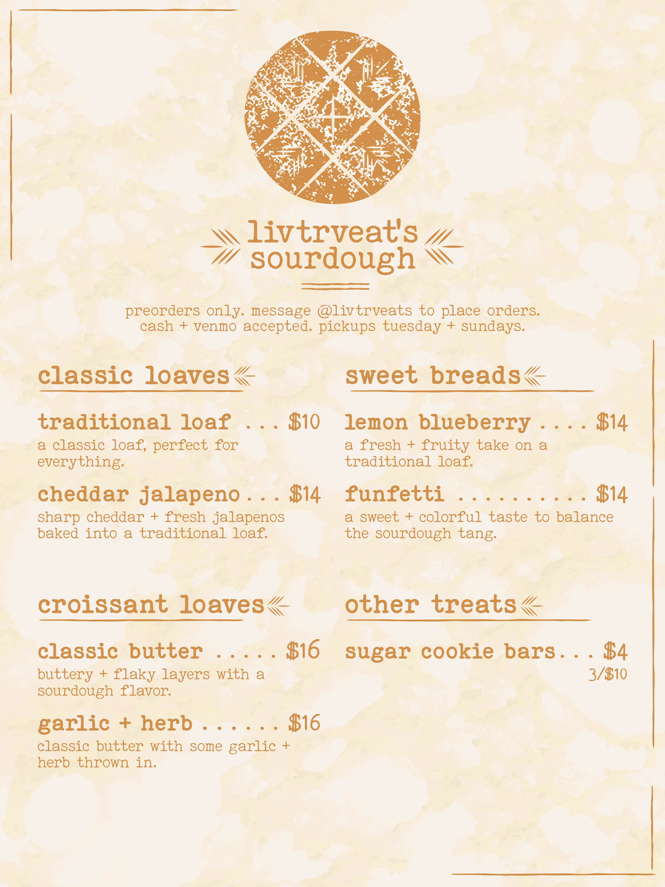
My oldest sister, Olivia, has been baking sourdough for a while now, sharing her journey on social media. In early April 2026, she decided to take things a step further and begin selling her bread. She created a menu outlining her flavors, pricing, and pickup details - everything needed to start taking orders.
When my parents showed it to me, one thing immediately stood out: the menu was entirely AI-generated, complete with spelling errors. While I understood the need for a quick, time-saving solution, as she's a teacher who also works shifts at a local restaurant, it took away from the identity of a homemade, independent sourdough business. As a graphic designer, I saw an opportunity to create something more intentional, recognizable, and reflective of her work.
Naturally, bread became the central focus of the design. The logo is built from a roughened circle with linework inspired by bread scoring, layered with texture to create a rustic feel. I paired this with a typeface that complements that aesthetic: Special Elite, a font I've been consistently drawn to as of late. The background uses a modified image of a bread interior, turning it into a subtle texture that adds depth without distraction. I also carried the scoring motif throughout the design, using it for bullet points and emphasis, along with loose, hand-drawn lines to break up sections.
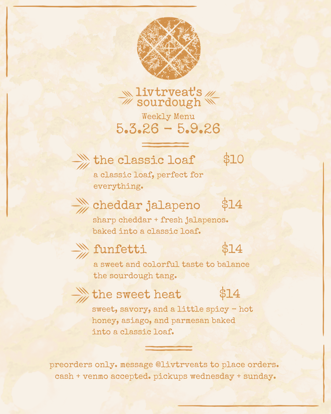
When I presented the initial design, she loved it! The main adjustment came with the menu layout. I hadn't accounted for her rotating weekly offerings. To solve this, I brought the assets into Canva and created a flexible, editable template she could easily update week to week.
Please go check her stuff out on her Instagram! And, if you are a local or find yourself in the area, maybe order yourself a loaf!