September 2024 // Assignment // Personal // Updated February 2025
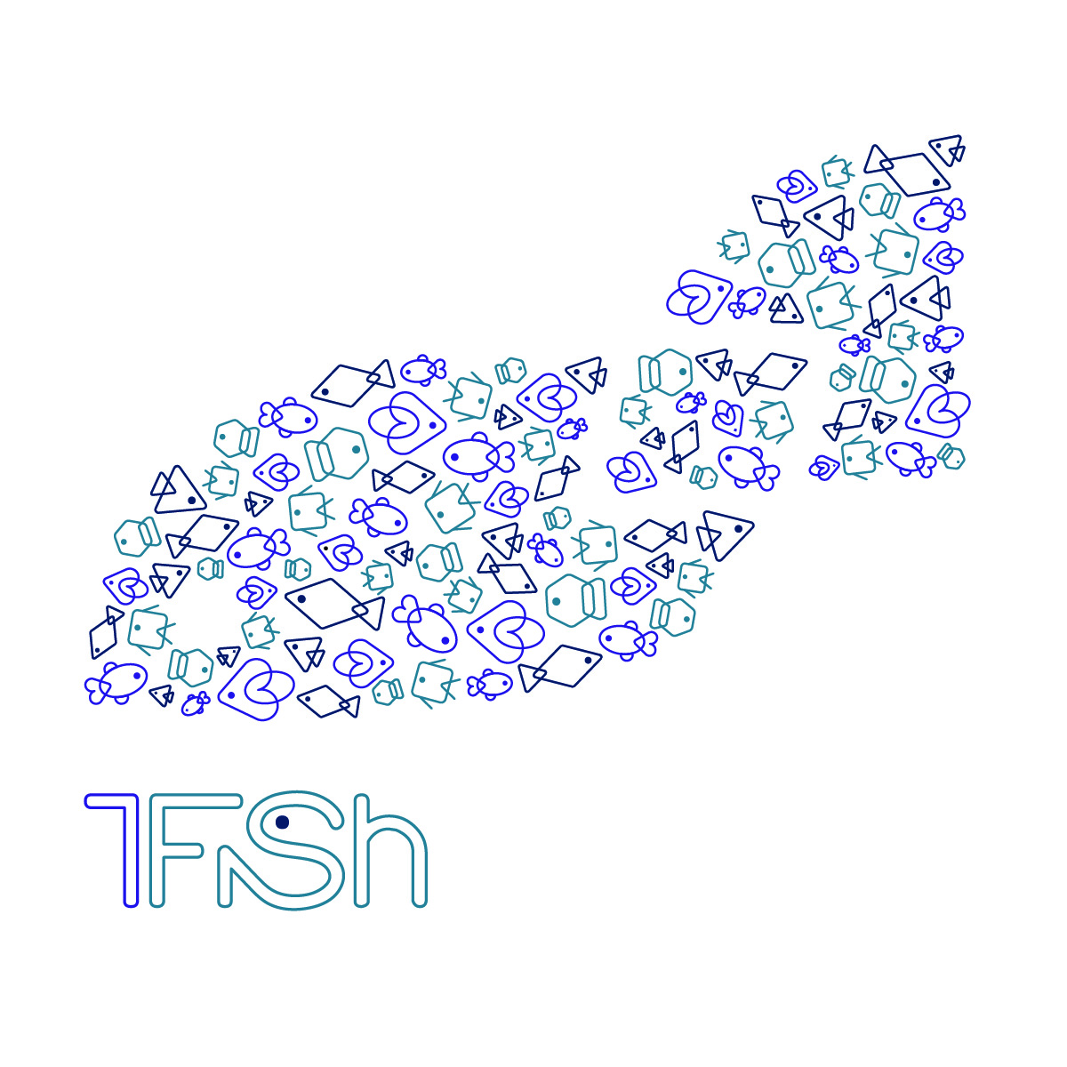
1Fish was born out of a small multiples assignment in my Branding and Packaging class. We were challenged to create several distinct marks that still felt like part of a larger whole. I wanted to design something cohesive yet flexible—unified under a simple but memorable name: 1Fish. The name itself plays with the idea of a singular identity amidst variation, which became the guiding principle for the visual system.
 |
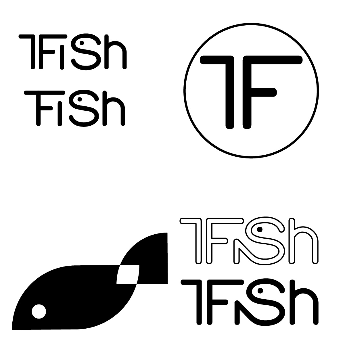 |
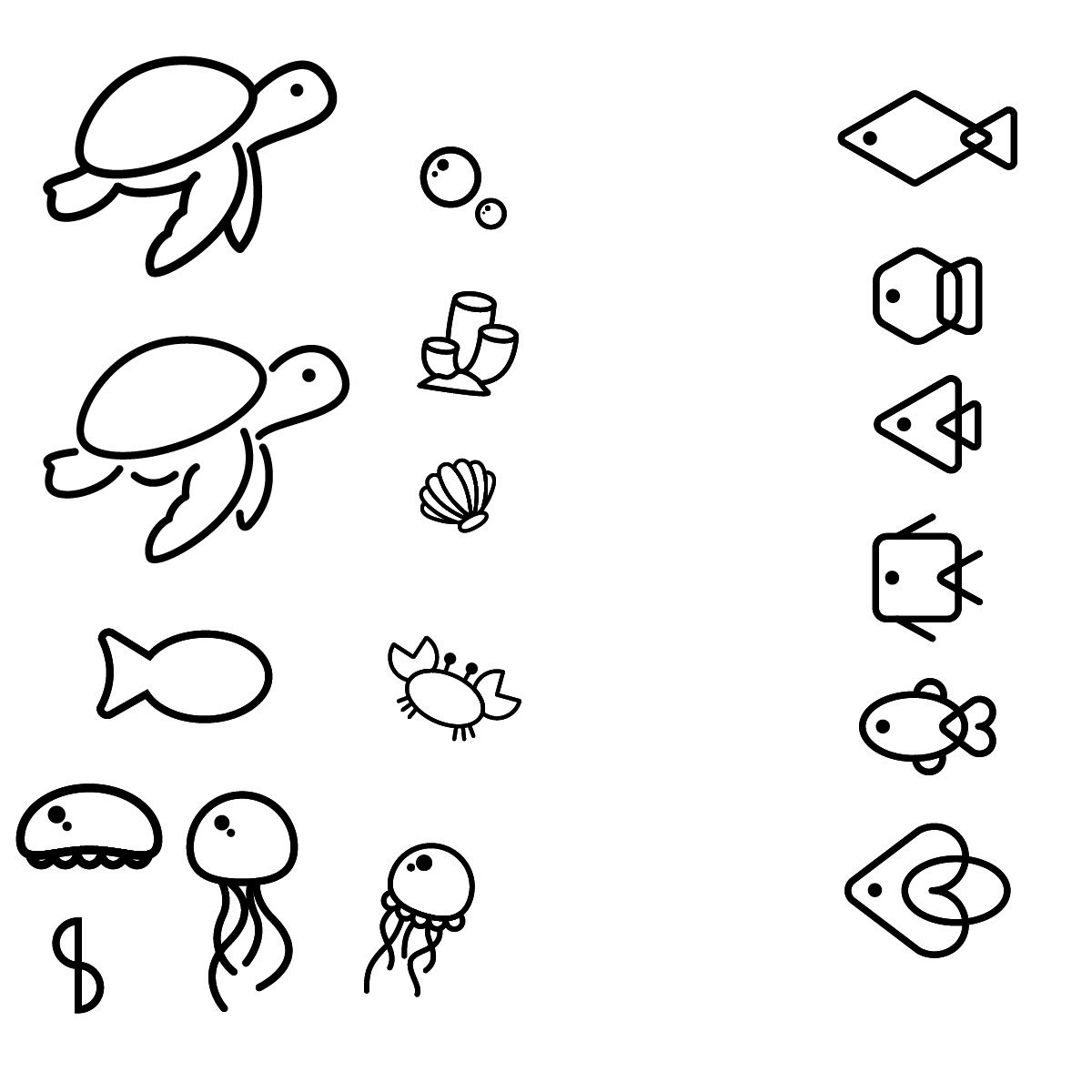
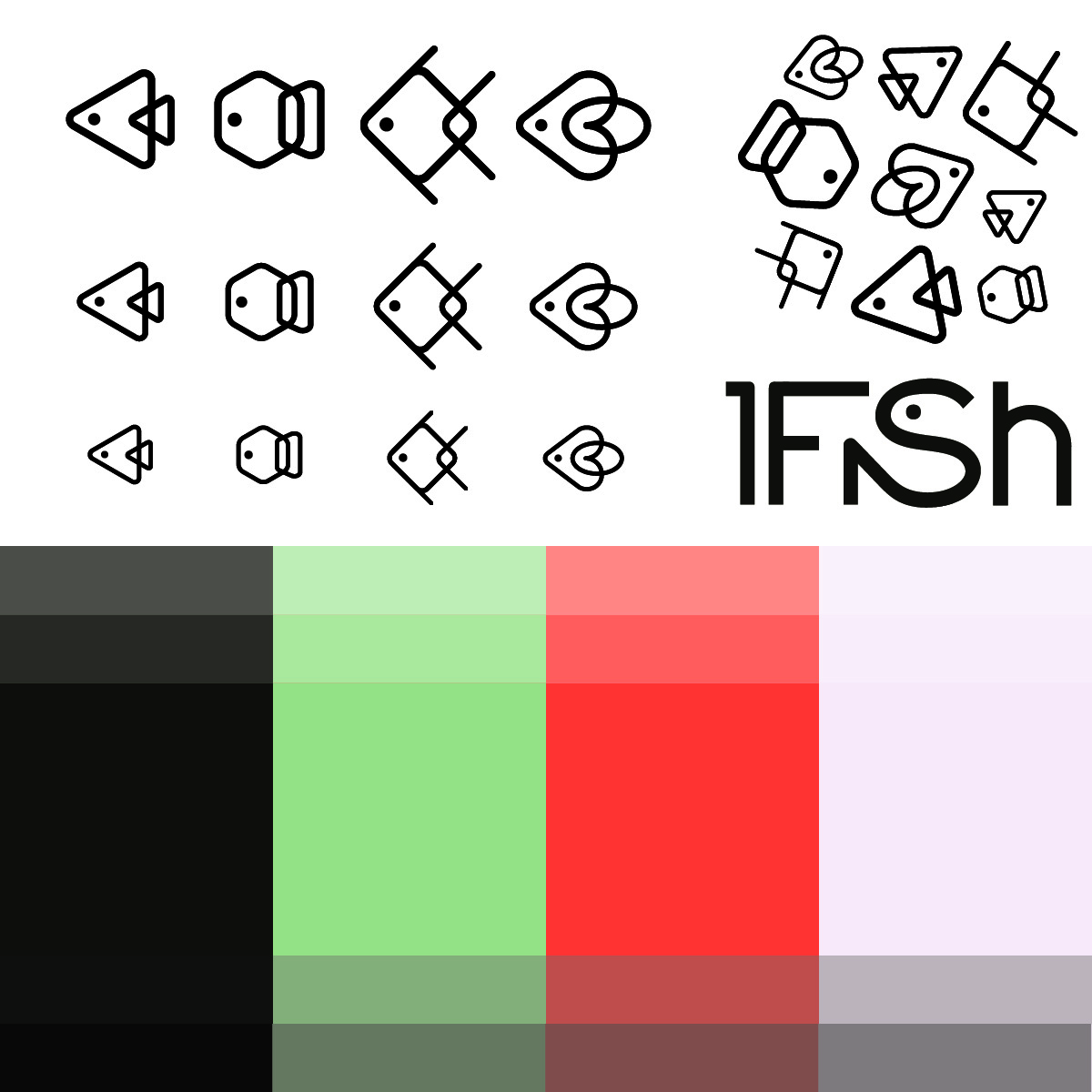
From the beginning, I knew I wanted to explore an aquatic theme. I played around with ideas involving jellyfish, turtles, and other sea creatures, but I eventually landed on these geometric fish. Their simple forms made them ideal building blocks for a cohesive visual system. I also explored custom typography for the brand name, incorporating a fish into the type itself thanks to some much needed feedback from my classmates!
 |
 |
 |
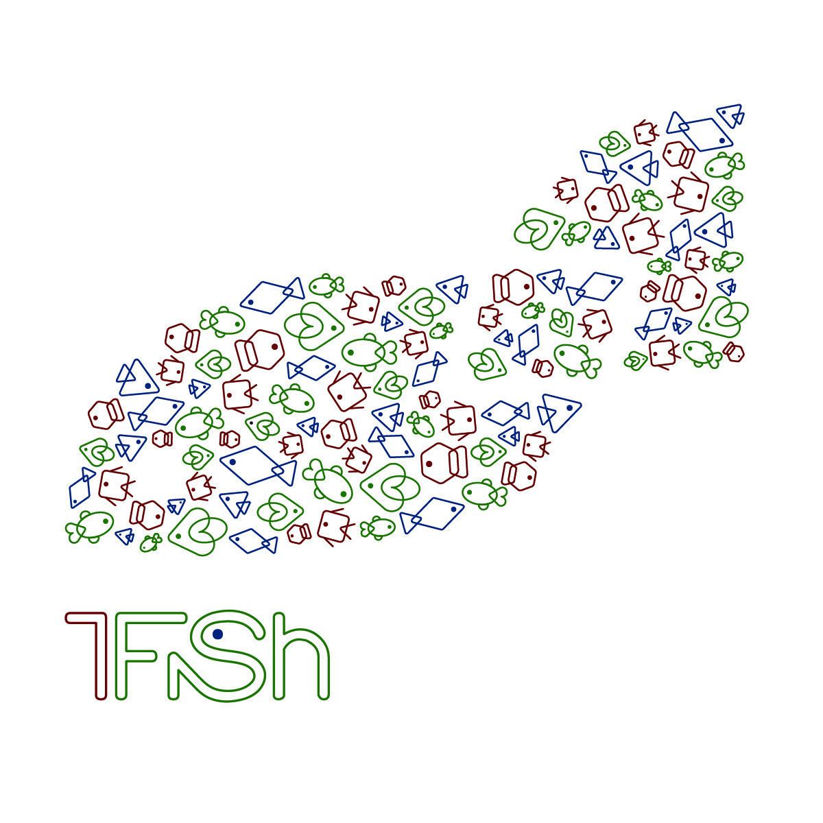 |
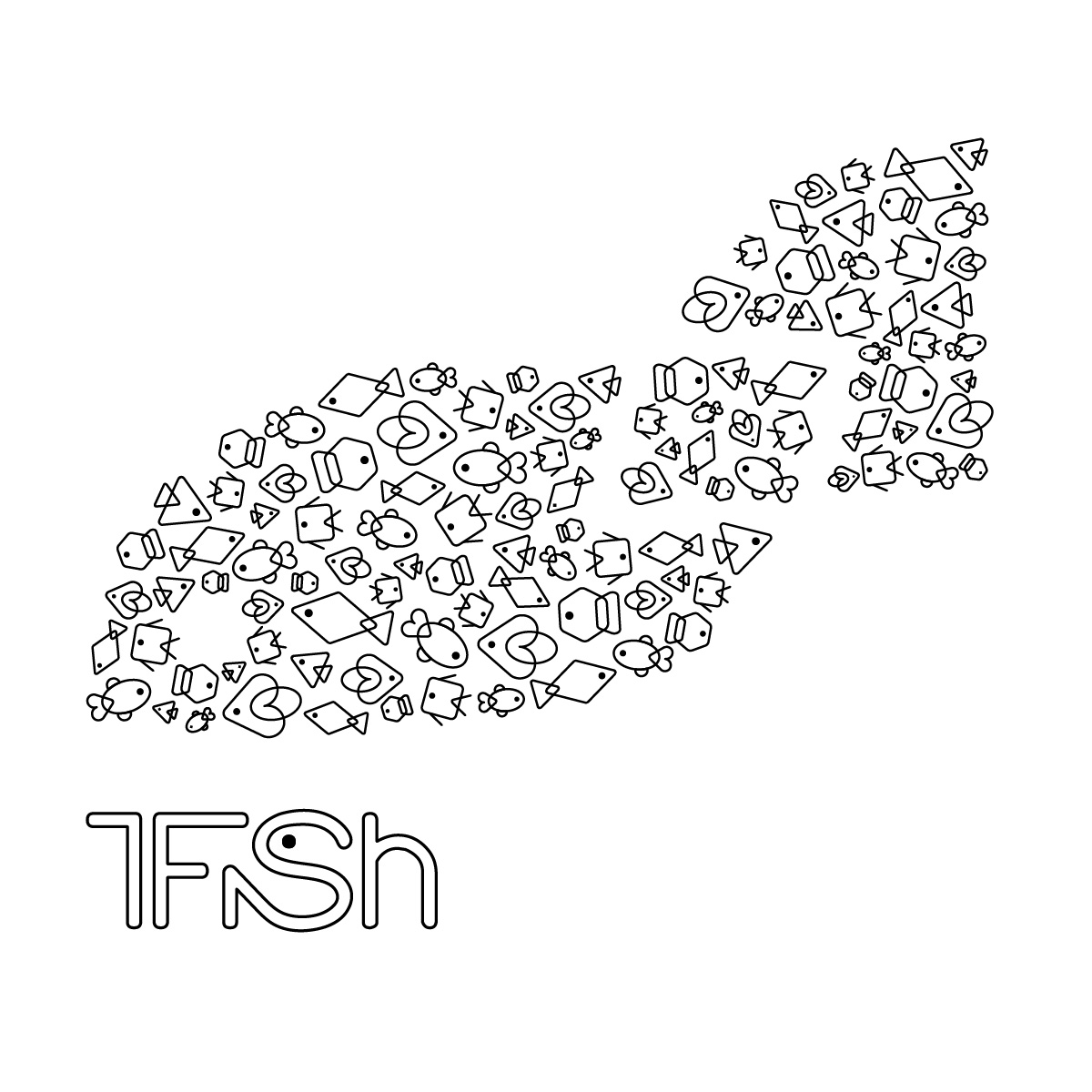
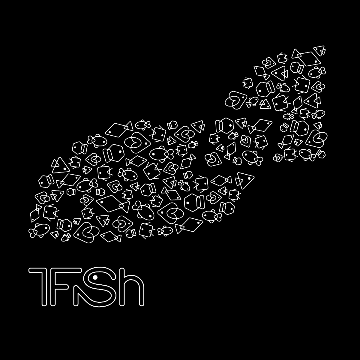
While this look leans toward a clean, corporate aesthetic, that structure gave me room to focus on consistency in form, scale, and rhythm throughout the logo. The result is a design that feels professional and modern, tied together by a shared shape language and visual tone. Though 1Fish doesn't exist as a real brand, the process was a great exercise in building branding systems that could stretch across multiple applications.
That said, there were a few elements I wasn't completely sold on. The “1” in the logo sometimes reads more like a “7,” which created a bit of confusion. I also wasn't fully satisfied with the color palette. Part of the assignment involved using specific color schemes, but I felt mine didn't hit the mark. Some of the fish forms, like the square, diamond, and oval ones, also didn't sit right with me. Their uneven use of negative space made them stand out awkwardly from the rest.
 |
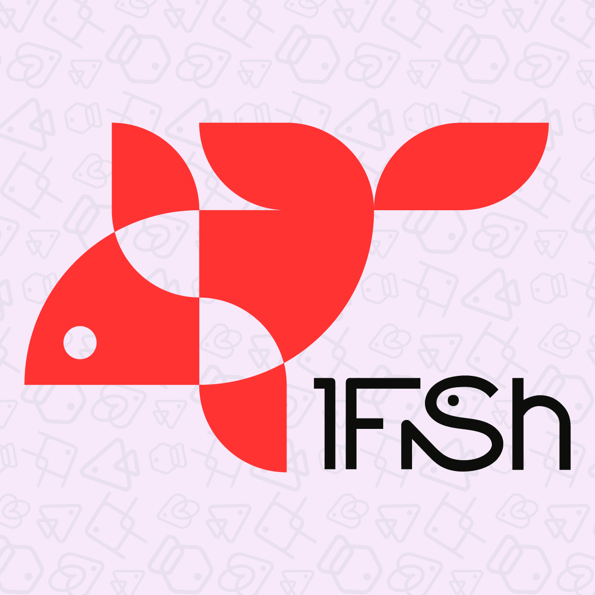 |
The final version features a cleaner logo, refined typography, and a more cohesive brand identity. I replaced the rounded edges in the type with flatter, sharper forms to better match the geometric fish. I also edited the “1” to remove some of the awkward overhang, which helped it read much more clearly. A classmate suggested tweaks to the main fish icon to make it more recognizable, and I ran with that feedback to create a stronger symbol. I removed the small multiples from the main logo and used them as a background pattern instead. Lastly, I updated the color scheme to one that feels much more aligned with the brand's tone.